Visual identity: logo, colours and images
⚠️ Required rights: an administrator profile with access to the Configuration tab (Assigning rights).
Visual identity: logo, colours and images
⚠️ Required rights: an administrator profile with access to the Configuration tab (Assigning rights).
The name, logo, colours, avatars and images your learners see are set from the back office, for the mobile app and the web version alike. You can prepare them before launch and change them at any time afterwards. This article is part of Customising the learner platform.
Opening the customisation page and saving your changes
- Click the gear icon at the top right of the back office to open Configuration.
- In the left-hand menu, open Customization > General customization. The page gathers all the settings described below, one after the other. A preview of the learner app is shown on the right, with three buttons to display it in mobile, tablet or desktop format.
- Make your changes in the relevant blocks.
- Click Save all, at the bottom of the left-hand menu, to record your changes. The button stays greyed out as long as no change is pending.
Avatars are the exception: each one is saved from its own window (see Avatars).
Colours
At the top of the page, the Graphical customization block holds two colour sets: the Default theme and the High contrast theme, which learners turn on from the settings of their app. Each theme is defined by two colours:
- the Main color, which carries your brand identity and is applied to the main elements of the interface, such as icons, buttons and bold text;
- the Main text color, which is applied to the text displayed on those elements.
When you change a colour of the default theme, the matching colour of the high contrast theme is recalculated automatically. You can then adjust it without changing the default theme.
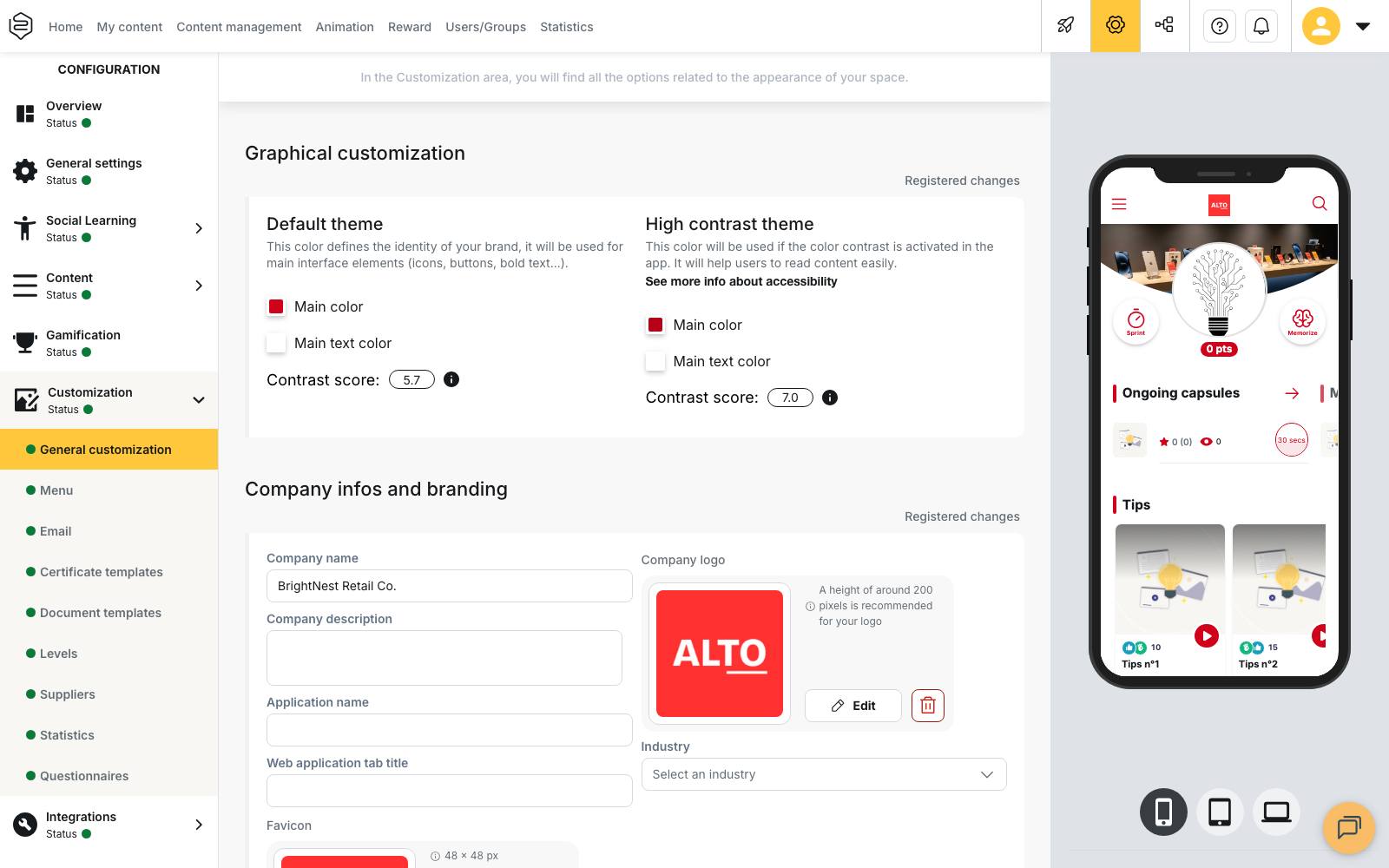
Under each theme, the Contrast score measures how readable the text colour is against the main colour, according to the WCAG and RGAA standards. Hover over the information icon next to the score to display the thresholds:
- 3 is the minimum expected for the default theme;
- 4.5 is the minimum expected for the high contrast theme;
- 7 is the ideal score.
Below the threshold, the score turns red and a red message appears under the theme concerned. This message does not block saving: you can save colours that do not meet the threshold.
💡 Tip: check the result on a real phone, in the conditions your learners use it, for example outdoors or with a dim screen.
Name, logo and favicon
The Company infos and branding block holds the elements that identify your platform:
- Company name: the name of your organisation in the platform.
- Application name: the name your learners see as the name of the app, including in notifications.
- Web application tab title: the text shown in the browser tab.
- Favicon: the small icon shown in that same tab, in 48 × 48 px.
- Company logo: the logo shown at the top of the learner platform. The recommended height is 200 px.
- Industry and Company description: this information is used to configure the AI and is not shown to learners.
What learners can change themselves
The Fields editable from within the application block lets you choose whether learners can edit their profile. The two checkboxes are independent.
- Alias is editable allows learners to change the name under which they appear, for example in rankings. By default, this alias is the part of their email address before the @ sign; with an HRIS synchronisation, their first and last name are shown instead.
- Photo is editable allows learners to add a profile photo, visible for example when they post a tip. Without a photo, their avatar is shown instead.
Avatars
The Avatars management block defines the avatars that illustrate your learners’ progress. Each avatar matches a level with a points threshold: a learner gets the avatar of a level once their points total reaches that threshold. Learners do not choose their avatar; what they can change is their profile photo, if you allow it.
To edit or add a level:
- In the Avatars management block, click the level to edit, or Add a level to create an extra level. A window titled Level followed by the level number opens.
- Enter the Name and Description of the avatar. On a multilingual account, fill in both fields in each language added.
- Enter the threshold in the Points field. The threshold starts at 0 and is set in steps of 5. For a new level, a value is suggested: 0 for level 1, 60 for level 2, then twice the previous level (120, 240, 480…). Adjust it to the amount of content you deliver.
- In the Image field, import an image, cropped to a square, or an SVG visual. A level keeps only one visual: the last one chosen replaces the other.
- Save the level from the window. Saving stays unavailable as long as the name, description, threshold or visual is missing. The avatar is recorded as soon as you save it: Save all is not needed.
⚠️ First change: as long as your account uses the avatars provided by Beedeez, clicking a level opens a warning before the edit window: “Custom avatar creation will disable default avatars.” If you cancel, nothing changes and the warning appears again on your next click. If you confirm, the default avatars are copied into your account’s own list, and that is the list you edit from then on. This warning does not appear when a department is selected: see below.
Only levels added beyond the tenth can be deleted: the delete button does not appear in the window of the first ten levels. You are asked to confirm before the deletion.
On an account organised in departments, a department without its own avatars shows those of the account configuration. When you select such a department, a yellow message above the list tells you so. Add avatars to that department to replace them.
💡 Tip: space out the thresholds according to the number of points your content lets learners earn. Too low, and learners quickly reach the last avatar; too high, and they may lose motivation.
How points are calculated and what learners see of their avatar are covered in Points and avatars.
Home banner and login page image
Further down the same page, two blocks hold the large images of your platform:
- Home banner image: the image shown at the top of the home page of the learner app. The expected format is 2000 × 630 px.
- Login page image: the image shown on the sign-in page. The expected format is 1920 × 1080 px.
The imported image is cropped to these proportions.
White-label app visuals
⚠️ Prerequisite: this part requires the white-label option (Why can’t I see this feature?).
The app visuals are set under Customization > White Brand App. This page only appears in the menu when the option is active, and only at account level. Each visual of the Images block has a required format; only the dimensions are recalculated automatically.
| Visual | Where it appears | Constraint |
|---|---|---|
| Icon | The app list on the phone | .png, 1024 × 1024, no transparency |
| Logo | Inside the app | .png, preferably 1024 × 1024 |
| Notifications | Android bar when a notification arrives | .png, 75 × 75, white on a transparent background |
| Background color | Behind the Android notification icon | A colour, not an image |
| Login GIF | The screen where the learner chooses a sign-in method on mobile | .gif |
| Splash screen | When the app launches | .png, 2500 × 2500 |
| Android feature graphic | The Google Play Store listing | .png, 1024 × 500 |
💡 Tip: if you do not supply them, Generate default creates the splash screen from the logo, and the Android feature graphic from the splash screen.
⚠️ Two opposite transparency rules: the app icon accepts no transparency at all, whereas the notification icon requires greyscale pixels on a transparent background, with an empty strip of 15 pixels on each side. A rejected visual usually comes from this difference.
The Store visuals block holds the screenshots of the App Store and Google Play listings, in two
sets: Big screens and Tablets. Each set takes 2 to 8 visuals in .jpeg format. Choose
screens that represent what your learners will actually do.
Customising a department
On an account with the hierarchy option and organised in departments, you can give each department its own visual identity.
- In Configuration, select the department in the drop-down list at the top of the left-hand menu.
- Open Customization > General customization. Department-specific fields replace those of the account: Department brand name, Department app name, Department description and Department logo.
- Make your changes, then click Save all.
The Login page image cannot be changed for a department: deselect the department to change it in the general configuration of the account.
To return to the account customisation and clear the changes made to a department, click Reset customization, above Save all. A Reset department settings window asks for confirmation and states that this department will inherit the general customization.
A learner only sees the branding of the department they belong to. If they belong to several departments customised differently, the branding of their Main department is shown; this field is set on their user profile.
⚠️ Check the department selected in the drop-down list before editing: the screen is the same for the account and for a department.
What customisation does not allow
- Renaming the app in the stores without the white-label option. Your learners then install Beedeez Training: your identity only appears once they are signed in.
- Changing the typography. No font setting exists in the customisation screens.
Going further
- Points and avatars: how learners earn points and what they see of their avatar.
- The mobile app: white label or Beedeez Training: what your learners install, and the rest of the store listing.
- Accessibility at Beedeez: what the high contrast theme covers on the learner side.
- General options: the support email and account languages.